
Definition
In math, a graph can be defined as a pictorial representation or a diagram that represents data or values in an organized manner. The points on the graph often represent the relationship between two or more things.2
A graph or chart or diagram is a diagrammatical illustration of a set of data. Graphs must be accurate and convey information efficiently. Ideally, graphs will also be aesthetically pleasing. Please note that “graph”, “chart” and “diagram” are ambiguous terms, sometimes used interchangeably.3
Graphs and charts can make it easier for people to interpret information. There are many types of graphs and charts that organize data in different ways, and they are commonly used for business purposes. It is important to know the different types of graphs and charts so you can choose the best one to display your information, especially when making professional presentations.8
On this page we are not discussing graph theory, but the different types of graphs, their uses, how to read a graph, and what to look for in misleading graphs.
(For an excellent discussion of graphs to use in statistics, please see DataViz: How To Choose The Right Chart For Your Data by Lee Baker of Chi-Squared Innovations in Additional Reading.)
Who
In my 40+ years of work, I have used and seen many different types of charts and graphs when I worked in project management, science, business and management.
What
Graphs and charts are visuals that show relationships between data and are intended to display the data in a way that is easy to understand and remember. People often use graphs and charts to demonstrate trends, patterns and relationships between sets of data. Graphs may be preferable to display certain types of data, while charts are ideal for others. The chart or graph you choose will often depend on the key points you want others to learn from the data you’ve collected.8

Graphs vs. charts: What’s the difference?
While many people use ‘graph’ and ‘chart’ interchangeably, they are different visuals. Charts are tables, diagrams or pictures that organize large amounts of data clearly and concisely. People use charts to interpret current data and make predictions. Graphs, however, focus on raw data and show trends over time.8
Different types of graphs
You can choose from many types of graphs to display data, including:8
- Line graph
Line graphs illustrate how related data changes over a specific period of time. One axis might display a value, while the other axis shows the timeline. Line graphs are useful for illustrating trends such as temperature changes during certain dates. - Bar graph
Bar graphs offer a simple way to compare numeric values of any kind, including inventories, group sizes and financial predictions. Bar graphs can be either horizontal or vertical. One axis represents the categories, while the other represents the value of each category. The height or length of each bar relates directly to its value. Marketing companies often use bar graphs to display ratings and survey responses. - Pictograph
A pictograph uses pictures or symbols to display data instead of bars. Each picture represents a certain number of items. Pictographs can be useful when you want to display data in a highly visual presentation such as an infographic. For example, you could use a picture of a book to display how many books a store sold over a period of a few months. - Histogram
A histogram is another type of bar graph that illustrates the distribution of numeric data across categories. People often use histograms to illustrate statistics. For example, a histogram might display how many people belong to a certain age range within a population. The height or length of each bar in the histogram shows how many people are in each category. - Area graph
Area graphs show a change in one or more quantities over a certain period of time. They often help when displaying trends and patterns. Similar to a line graph, area graphs use dots connected by a line. However, an area graph involves coloring between the line and the horizontal axis. You can use several lines and colors between each one to show how multiple quantities add up to a whole. For example, a retailer might use this method to display the profits of different stores over the same timeframe. - Scatter plot
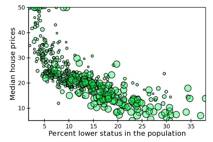
Scatter plots use dots to depict the relationship between two different variables. Someone might use a scatter plot graph to show the relationship between a person’s height and weight, for example. The process involves plotting one variable along the horizontal axis and the other variable along the vertical axis. The resulting scatter plot demonstrates how much one variable affects the other. If there is no correlation, the dots appear in random places on the graph. If there is a strong correlation, the dots are close together and form a line through the graph.
Line Graph

Bar Graph

Pictograph

Histogram

Area graph

Scatter plot
Different types of charts
There are seven common charts you can use to display information:8
- Flowchart
Flowcharts help organize the steps, decisions or actions in a process from beginning to end. They often include more than one starting point or endpoint, displaying different paths you can take in a process to get from start to finish. People often use flowcharts to depict complex situations. They use special shapes to illustrate different parts of the process, and they typically include a legend to explain what each shape means. - Pie chart
A pie chart presents the different parts of a whole. It looks like a circle divided into many pieces, much like a pie cut into slices. The pieces are different sizes based on how much of the whole they represent. Each piece usually has a label to represent its value compared to the whole. Professionals can use pie charts in business presentations to demonstrate population segments, market research responses and budget allocations. - Gantt chart
Gantt charts illustrate project schedules. The horizontal axis represents the timeframe for the project in days, weeks, months or years. The chart displays each project task as a bar on the vertical axis. The length of the bar depends on the start and end date of the task, but sometimes there is also a vertical line for the current date. Project managers use Gantt charts to monitor the progress and completion status of each task. - Waterfall chart
Waterfall charts reflect variance over time. They demonstrate both the positive and negative impact of different factors on an initial value, such as an opening balance. Waterfall charts are helpful when illustrating financial statements, analyzing profit and loss and comparing earnings. You might use this chart to highlight the budget versus the amount spent. Positive and negative values usually follow a color code to show how the value increases or decreases due to a series of changes over time. - Gauge chart
Gauge charts display data as a reading on a dial. They show where a specific data point is within a minimum or maximum range. A needle depicts the value within a scale. Many people use gauge charts to illustrate speed, revenue goals and temperatures. - Funnel chart
Funnel charts illustrate how values progress through different stages. They are widest at the top and narrowest at the bottom. Funnel charts are especially helpful when tracking a sales process. They also work well to depict website traffic, including the number of visitors to a site, the pages viewed and downloads made. Order fulfillment is another common use for funnel charts, as they can easily show the “number of orders placed, canceled and delivered. - Bullet chart
A bullet chart can help you measure the performance of a specific goal or target. Some bullet charts, such as those that demonstrate profits, have high targets. Others have low targets, including those that display expenses. People often use bullet charts in dashboards to illustrate the progress of key performance indicators (KPIs). A bullet chart is similar to a bar graph and consists of three parts:- A line showing the target value
- A center bar showing the actual value
- Colored bars showing performance indicators
Flowchart

Pie chart

Gantt chart

Waterfall chart

Gauge chart

Funnel chart

Bullet chart

Why
A good chart can inspire action. Early epidemiologist John Snow’s 1854 map with data appears to have saved many lives. Snow showed the location of London’s 13 public wells and 578 cholera deaths by stacked bars perpendicular to the their location. His graphic, in part, appears to have helped convince the city to shut down the infected well.
Five Takeaways From The Visual Display Of Quantitative Information
- Less is more. “Above all else show the data” (p. 92). Erase everything you don’t need.
- “Graphical excellence consists of complex ideas communicated with clarity, precision, and efficiency.” (p. 51)
- Keep it proportional! “Lie Factor = size of effect shown in graphic divided by size of effect in data” (p.57). Keep it close to 1.
- You don’t have to use a graphic when there isn’t much data — a table is often better.
- Pie charts are useless. The dude hates pie charts.
We’re living in a golden age of data graphics. The Washington Post, Vox, the New York Times, The Pudding, and many other outlets making interactive graphics on websites that are informative and beautiful. Interactive digital data graphics can be amazing.
But data graphics can also distort information in their attempts to persuade. As consumers of data graphics, it behooves us all to arm ourselves with a more thorough language and understanding of data graphics. Tufte’s classic should be required reading. After reading it you’re likely to look at data graphics with a more critical eye and view masterpieces with more appreciation.1
See Theoretical Knowledge Vs Practical Application.
Box and Whisker Plots
Box and whisker plots, sometimes known as box plots, are a great chart to use when showing the distribution of data points across a selected measure. These charts display ranges within variables measured. This includes the outliers, the median, the mode, and where the majority of the data points lie in the “box”. These visuals are helpful to compare the distribution of many variables against each other.7
Box plot or Box-and-Whisker plot is one of the most popularly used methods to statistically visualize data.

It shows us a 5-number summary – minimum, first quartile, median, third quartile and maximum.
- Minimum: the lowest value excluding the outliers.
- First quartile or Lower quartile (Q1): 25% of all the values in the data lie below this value.
- Median: represented by a line in the box. It is value exactly at the centre of the data, i.e. a value below which lies 50% of the data points.
- Third quartile or Upper quartile (Q3): value below which lie 75% of all the data points.
- Maximum: the highest value excluding the outliers.
Upper and lower quartile values help us find the Inter-quartile Range (IQR). IQR consists of 50% of the data points.
The long whiskers, tails extending from the box and the outliers depict the remaining 50%. Box plot also helps us know if our data consists of outliers. Beyond the whiskers lie the outliers.9
Polar Coordinates
From a physicist’s point of view, polar coordinates (randθ) are useful in calculating the equations of motion from a lot of mechanical systems.
Quite often you have objects moving in circles and their dynamics can be determined using techniques called the Lagrangian and the Hamiltonian of a system. Using polar coordinates in favor of Cartesian coordinates will simplify things very well.
Hence, your derived equations will be neat and comprehensible .
Besides mechanical systems, you can employ polar coordinates and extend it into a 3D ( spherical coordinates ). This will help a lot in doing calculations on fields . Example: electric fields and magnetic fields and temperature fields.
In short, polar coordinates make calculation easier for physicists and engineers. Thanks to that, we have better machines and better understanding on electricity and magnetism (essential for generating power).4
Polar graphs are used for illustrating the directivity of microphones, loudspeakers, and both receiving and transmitting antennas.5
Polar coordinates can be very useful for anything involving rotation. One classic example is the plan-position indicator (PPI), familiar from many movies. Here’s an image from the linked article.
Here, we see a beam sweeping around in a circle, with distance measured from the center. We might specify a point as having an angle from a reference direction and a distance from the origin. As we hear in war movies, we’d get a position report as, “Bearing 40 degrees, distance 23 miles!” We could specify the point in Cartesian coordinates (aka rectangular coordinates), but that would be pretty clunky. Polar coordinates make the position much clearer.
For complex numbers, some things are easier in polar representation, and some are easier in rectangular representation.
(Images from the linked Wikipedia article: By Wolfkeeper at English Wikipedia, CC BY-SA 3.0, File:Complex number illustration.svg)
For addition and subtraction, the rectangular form (upper diagram) is easier to use, but for multiplication and division, the polar form (lower diagram) is easier to use.
In daily life, we use variations on polar coordinates more than you might imagine. For example, we might say, “Turn left onto Main Street and drive 2 kilometers”. We just specified an angle and a distance.6
How
Many of the References and Additional Reading websites and Videos will assist you with the different types of graphs and charts.
As some professors say: “It is intuitively obvious to even the most casual observer.”
References
1 “Five Takeaways From The Visual Display Of Quantitative Information”. 2019. Medium. https://jeffhale.medium.com/five-takeaways-from-the-visual-display-of-quantitative-information-dd36dae35299.
2 “What Is Graph? – Definition, Facts & Example”. 2022. splashlearn.Com. https://www.splashlearn.com/math-vocabulary/geometry/graph.
3 “Wikipedia:Graphs And Charts – Wikipedia”. 2022. en.Wikipedia.org. https://en.wikipedia.org/wiki/Wikipedia:Graphs_and_charts.
4 “Introduction To Polar Coordinates – Calculus | Socratic”. 2022. socratic.org. https://socratic.org/calculus/polar-curves/introduction-to-polar-coordinates.
5 Soloway, Scott. “What Are Real-Life Examples Of Polar Graphs (I.E. Shell Pattern)?”. 2022. Quora. https://www.quora.com/What-are-real-life-examples-of-polar-graphs-i-e-shell-pattern.
6 Cole, Tim. “What Are Polar Coordinates Used For In Real Life?”. 2022. Quora. https://www.quora.com/What-are-polar-coordinates-used-for-in-real-life.
7 “Understanding And Using Box And Whisker Plots”. 2022. Tableau. https://www.tableau.com/data-insights/reference-library/visual-analytics/charts/box-whisker.
8 “Types Of Graphs And Charts | Indeed.Com”. 2022. Indeed Career Guide. https://www.indeed.com/career-advice/career-development/types-of-graphs-and-charts.
9 Gaonkar, Akshada. “Understanding Box-And-Whisker Plot”. 2021. Medium. https://medium.com/swlh/understanding-box-and-whisker-plot-275e9163eac0.
Additional Reading
“44 Types Of Graphs & Charts [& How To Choose The Best One]”. 2020. Visme Blog. https://visme.co/blog/types-of-graphs/.
Baker, Lee. Graphs Don’t Lie – How to lie with graphs (and get away with it). Dundee, Tayside, Scotland: CSI Publishing, 2017.
Graphs might not lie, but if you plot biased data on a graph or elect to represent truthful data on an inappropriate graph, you’ll be guilty of misleading your audience. And that’s the whole point. When plotting graphs and charts you have choices and some of the choices are more appropriate than others. Do you want to tell the truth? Then choose wisely. Would you like your company to make more money or your preferred candidate to garner more votes? Perhaps you might prefer to choose a little less wisely. If you’re comfortable with using graphs to misrepresent the truth – and even prefer them as a vehicle for profit or career enhancement – then this book will help you find lots of ways to tell untruths with your graphs.
⭐ “Discover Visualisation | Chi-Squared Innovations”. 2022. Chi-Squared Innovations. https://www.chi2innovations.com/category/blog/discover-visualisation-blog-series/.
- Bar Charts – The One Secret to Getting Them Right
- Box and Whiskers Plots – What Are You Missing in Your Analysis?
- Bubble Charts – Top Tips to Amp Up Your DataViz Skills
- Column Charts – How to Master the Most Used Chart in DataViz
- Confusion Matrix – The Basics You Should Be Constantly Reviewing
- Contingency Tables – Your Top Questions Answered (and more)
- Gaussian Curves: What Are They And What To Do With Them
- Line Charts – What Are You Missing in Your Analysis?
- Pie Charts – Why You’re Failing (And How to Succeed)
- Scatter Plots – What Separates the Pros from the Novices
“Edward Tufte: Books – The Visual Display Of Quantitative Information”. 2022. edwardtufte.com. https://www.edwardtufte.com/tufte/books_vdqi.
The classic book on statistical graphics, charts, tables. Theory and practice in the design of data graphics, 250 illustrations of the best (and a few of the worst) statistical graphics, with detailed analysis of how to display data for precise, effective, quick analysis. Design of the high-resolution displays, small multiples. Editing and improving graphics. The data-ink ratio. Time-series, relational graphics, data maps, multivariate designs. Detection of graphical deception: design variation vs. data variation. Sources of deception. Aesthetics and data graphical displays.
⭐ MᶜGarry, Mike. 2016. “GRE Data Interpretation Practice Questions”. Magoosh Blog — GRE® Test. https://magoosh.com/gre/gre-data-interpretation-practice/.
Why is there Data Interpretation on the GRE? Why is this important? Well, do you know the old adage “A picture is worth a thousand words“? Well, a graph is worth even more. Geeky math & techie folks, such as I, absolutely love graphs and charts, because they present an efficient means to convey a truckload of information in way that is directly visually accessible. In our post-modern electronic world, the sheer amount of information available is simply mind-boggling. Graphs and charts are essential for keeping track of all this information.
Here’s one big suggestion for GRE Data Interpretation: if you are not a geeky math or techie person, start looking at graphs & charts. Look in the financial news, in scientific articles, and in international news in general. Most newspapers and news magazines are stuffed to the guppers with graphs & charts. Spend time studying them: each graph, each chart, has a “story” to tell. Spend enough time with each to understand its “story.”
⭐ Merriam, Areeba. “Why is the Cartesian Coordinate System Not Always the Best Choice”. 2023. Medium. https://www.cantorsparadise.com/why-is-the-cartesian-coordinate-system-not-always-the-best-choice-f88bf9f56436.
While Cartesian coordinates are the most commonly used, powerful, and versatile tool for describing many geometric shapes and physical systems, but still in some cases, these coordinates can lead to more complex equations and calculations. Therefore, polar coordinates can be a more effective and convenient choice for describing circular, spherical, and cylindrical systems.
“Reading: Types Of Graphs | Microeconomics”. 2021. courses.lumenlearning.com. https://courses.lumenlearning.com/microeconomics/chapter/reading-types-of-graphs/.
Three types of graphs are used in this course: line graphs, pie graphs, and bar graphs. Each is discussed in the lesson on the website.
“The Different Types Of Charts And Graphs You Will Use”. 2020. Wpdatatables – Tables And Charts WordPress Plugin. https://wpdatatables.com/types-of-charts/.
“Top 10 Types Of Charts And Their Usages”. 2022. edrawsoft. https://www.edrawsoft.com/chart-types-uses.html.
To get effective analyzing and communicating results, you may sift through lots of data for your jobs. When you manage multiple sources of data, it can get overwhelming and may make you frustrating. You’d better know what should be tracked and what matters. Also, figure out how you can visualize and analyze the data to take out key insights and actionable information. More importantly, if you want to make reports on these results and data efficiently, the article will show you the top 10 types of charts and their tips to use.
⭐ Unzueta, Diego. “Data Visualization Theory: An Introduction”. 2022. Medium. https://towardsdatascience.com/data-visualization-theory-an-introduction-a077c0d80498.
Knowing how to tell a story efficiently is one of the hardest skills to master as a data scientist. Data visualization theory, although less sexy than other Data Science domains like machine learning, is arguably the most important part of a Data Scientist’s role. I see Data Scientists everywhere make visualizations that could be significantly improved by using some of the theory in this post.
In this article, I want to discuss some of the key aspects of data visualization. I will talk about the ways to visually encode information, and some of the key principles developed by psychologists throughout the history of this field. I finish off with some famous visualizations that helped shape the field.
Throughout the article, I’ll give examples of good and bad ways to visualize data, and I hope after reading this you too can avoid making visualizations like the monstrosity on top of this article.
Box and Whisker Plots
“Box And Whisker Plot – Definition, How To Draw A Box And Whisker Plot? | Example”. 2022. BYJUS. https://byjus.com/maths/box-and-whisker-plot/.
“What Is A Box And Whisker Plot? – When To Use Box Plots | ASQ”. 2022. asq.org. https://asq.org/quality-resources/box-whisker-plot.
Polar Graphs
“Learn: Polar Graphing”. 2022. Desmos. https://www.desmos.com/calculator/mqzaexmeek.
“Lesson POLAR COORDINATES”. 2022. algebra.com. https://www.algebra.com/algebra/homework/Trigonometry-basics/THEO-20100220.lesson.
“Polar Coordinates | Algebra And Trigonometry”. 2022. courses.lumenlearning.com. https://courses.lumenlearning.com/suny-osalgebratrig/chapter/polar-coordinates/.
“Polar Coordinates: Graphs | Algebra And Trigonometry”. 2022. courses.lumenlearning.com. https://courses.lumenlearning.com/suny-osalgebratrig/chapter/polar-coordinates-graphs/.
“Types Of Polar Graphs”. 2020. cloudshareinfo.blogspot.com. https://cloudshareinfo.blogspot.com/2020/02/types-of-polar-graphs.html.
Videos
⭐ I suggest that you read the entire reference. Other references can be read in their entirety but I leave that up to you.